
FERN SANTINI: When people walk in, they can't believe the house hasn't been here forever—it all feels so authentic. But it's only fourteen years old. When we renovated, we tried hard to bring authentic details into it—no faux finishes anywhere. Everything was done the way it would have beendone in the 1920s or '30s, so it doesn't scream 'last year.'
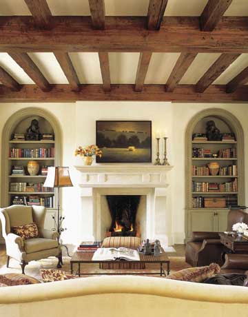
In the family room, off the kitchen, Santini added antique pine ceiling beams and raised the height of the arched bookshelves. A Cameron Collection sofa upholstered in Great Plains Velvet Etching sits in front of a custom coffee table by Abode. "I love those big leather Rose Tarlow chairs. They're so comfortable," says Santini. The antique iron floor lamp with an unusual cattails detail is from Watkins Culver.
When I first came through with my clients, it reminded me right away of all those Spanish-style houses Addison Mizner built in Palm Beach and Montecito in the 1920s and '30s. So we played that up, warming up the interior architecture, using some of the hallmarks of Mizner's style. That's what gives this house such elegance and livability, such amazing integrity.
What would you point to as Mizner hallmarks?
High ceilings that are brought down to scale with beautiful aged
wood beams are something he's known for. Mizner was also about mixing
different European styles—French, Italian, and Portuguese all together
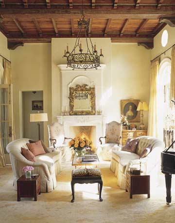
in one room. This living room has a French chandelier, an 18th-century
Italian mirror, corbels, plaster walls. A room that's this
unpredictable is very inviting, approachable. And I think a big part of
Mizner's appeal was the way he added wonderful outdoor spaces to his
architecture. The outdoor room here is one of the things I love most
about this house.
Oh, believe me, I can see why you'd be drawn out there.
When I walked outside for the first time, I died. Just died. I mean, that loggia has some classical influences that I love, like those arches, and the pool and pergola are truly amazing, but the view is really the focal point. You can see the entire Austin skyline and part of Lady Bird Lake winding through downtown, and if you look to the left there's a chain of lakes that leads up into the Hill Country.
The views are incredible, but when you're inside you really can't help looking up at those remarkable ceilings.
The ceilings were critical to bringing the house to where we wanted it to be. After they went up, the rooms instantly felt more intimate. We thought they needed to be the real deal—old wood. Our primary sources were antique long-leaf pine from old buildings that were being torn down. Their age gives them a great patina. The color is consistent and pure, and there is a mellowness that you don't find in new wood. They literally glow.
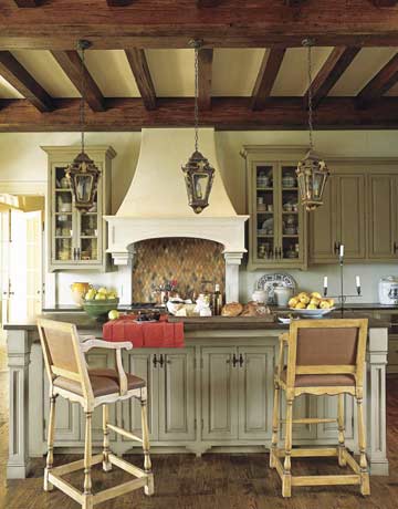
New kitchen cabinets were painted Benjamin Moore's Nantucket Gray and treated with a custom sienna glaze. Backsplash tiles are Torquemada Diamonds by Ann Sacks; lanterns are 18th-century Portuguese. Santini chose Sanford stools by Minton-Spidell for their sturdiness.
Are all the ceilings different?
Yes, there's actually a hierarchy to the ceilings here. The living room is the most elaborate. We used nine different geometric stencils and several books on Mizner's Palm Beach style as guides. The two women who did this work are artists, not faux painters, and they did it the way it would have been done originally. They used watered-down paints and sanded the edges so the paint looks worn in places.
It's such a lovely, subtle effect.
Nothing about this house is 'in your face.' All the exposed beams were waxed to take the shine off, and we mixed a pale honey color into the wall plaster. Everything was taken down a notch—mellowed—and that helped us to achieve what we were going for, a warmth, an intimacy.
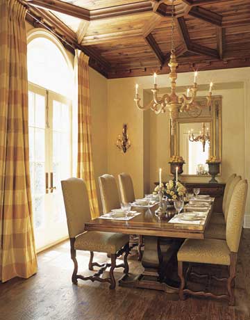
The dining room ceiling is based on an Addison Mizner design. Custom chairs from Watkins Culver are sizable. "Men hate small chairs," says Santini.
But with so much focus on period accuracy, how did you manage to avoid making it look like a museum diorama?
It was important to pay homage to the historical references, but not to pretend to be living in 1925. For instance, the living room drapes are a double silk sheer, light and billowy, not nearly as heavy as they might have been if they had been done in the '20s. My clients have grown children and grandchildren and they love to entertain, so the rooms needed to be light and welcoming. They needed to make you want to go in and look closer, then sit down and enjoy.
What are some other examples of how you approached decorating the house to make it more of-the-moment?
That 18th-century Italian gilt mirror in the living room. It doesn't quite fit over the mantel, at least in the conventional way, inside the lines of the molding. It's wonderfully free-form, so it's a great foil for that rather stiff molding. I think that placement brings the mirror's formality down a bit. That's what I tried to do in the whole house.
What are the lanterns in the kitchen? I'm sure Mizner would have loved those!
They're 18th-century Portuguese lanterns, and they were a spectacular find! Yes, I think Mizner would absolutely have done that. The fact that we were able to find a set of four is astounding. We put three over the counter and one in a vestibule nearby. They still have bits of old candle wax on the inside, and they even have the original red paint on the polychrome.
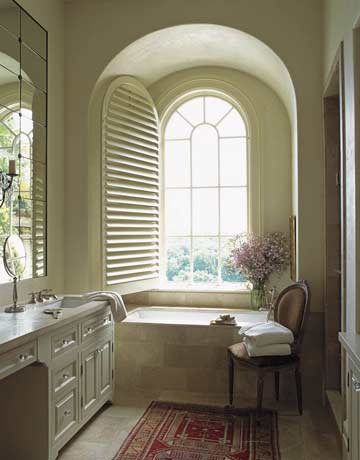
In the master bath Princess Yellow limestone from Ann Sacks surrounds a bathtub by Kohler.
The Oushak rugs add so much to the overall feel of the house.
I have always felt strongly that a house with such historical references shouldn't have new rugs—unless they are perfect reproductions. We wanted to give this house authenticity, and the Oushak rugs we placed everywhere were critical. When you're standing on them, you know they're old. And they give the house incredible personality.
The blue in the master bedroom is such a departure from the warm palette of the house. Were you influenced by the room's lake view?
No, not at all. The client and I just happened to fall in love with that color. It's serene. There's a pale bisque color with a little bit of gold in the carpet, which is repeated in the Princess limestone in the bath. And when you add in that beautiful gray blue, the whole thing becomes like a watercolor. Along with the blend of different period antiques, the lighting and art in the room, it creates such a relaxed mood.
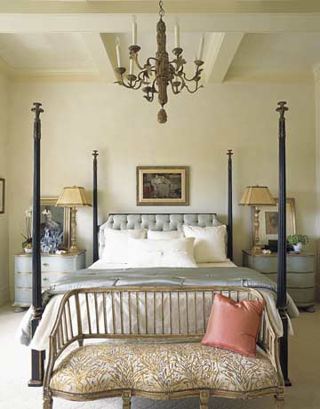
The master bedroom is the only room where Santini used a cool color—a steel blue for furniture and fabrics—because she wanted to create "a serene retreat." Headboard fabric on the Nancy Corzine bed is by Barbara Barry for Kravet; bedside tables are from Amy Howard.
I can't imagine that there would be a more coveted invitation in Austin than to be asked to a dinner party here. There's romance in every room!
The words 'warm, inviting, and intimate' came up in every conversation I had with these clients, which inevitably led to 'romantic.' When the lights are dimmed in the rooms here, there is this glow from the plaster walls and the ceilings that just envelops you. Then when you look out to the twinkling lights of the city...it is so beautiful, I can't tell you.
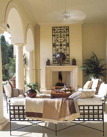
In
the outdoor room, "everything here is meant to be a backdrop for the
view," says Santini. "You can see the entire Austin skyline, and a
chain of lakes." Classic iron furniture from Janus et Cie.
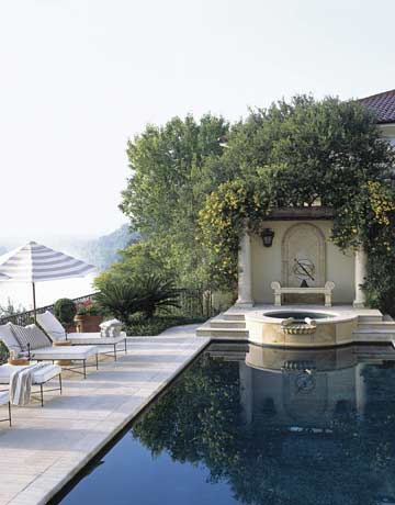
The pool and pergola overlook Lady Bird Lake. Umbrellas are from Crate & Barrel. Amalfi lounge chairs by Janus et Cie.
Interior Design By Fern Santini
Interview By Lisa Cregan
Photographs By Ngoc Minh Ngo


![A Tranquil Jungle House That Incorporates Japanese Ethos [Video]](https://asean2.ainewslabs.com/images/22/08/b-2ennetkmmnn_t.jpg)


